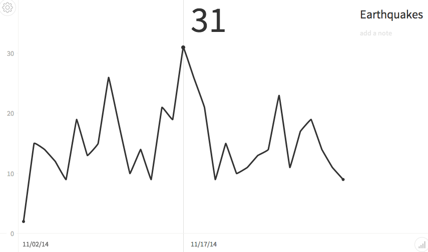
Make beautiful charts with RethinkDB queries and Charted.co
While building applications with RethinkDB, I often find cases where I want to be able to produce simple visualizations to help me better understand my data. Ideally, I’d like to take the output of a simple query and see what it looks like in a graph with as little work as possible. A new project recently introduced by the developers at Medium offers a compelling solution.
Medium’s product science team built a lightweight web application called Charted that makes it easy for users to generate and share graphs. As input, the user provides a URL that points to CSV data. Charted processes the data and produces simple graphs with a clean and elegant design. No configuration is needed, though it allows the user to choose between bar and line formats and customize certain aspects of the output.

 Ryan Paul


